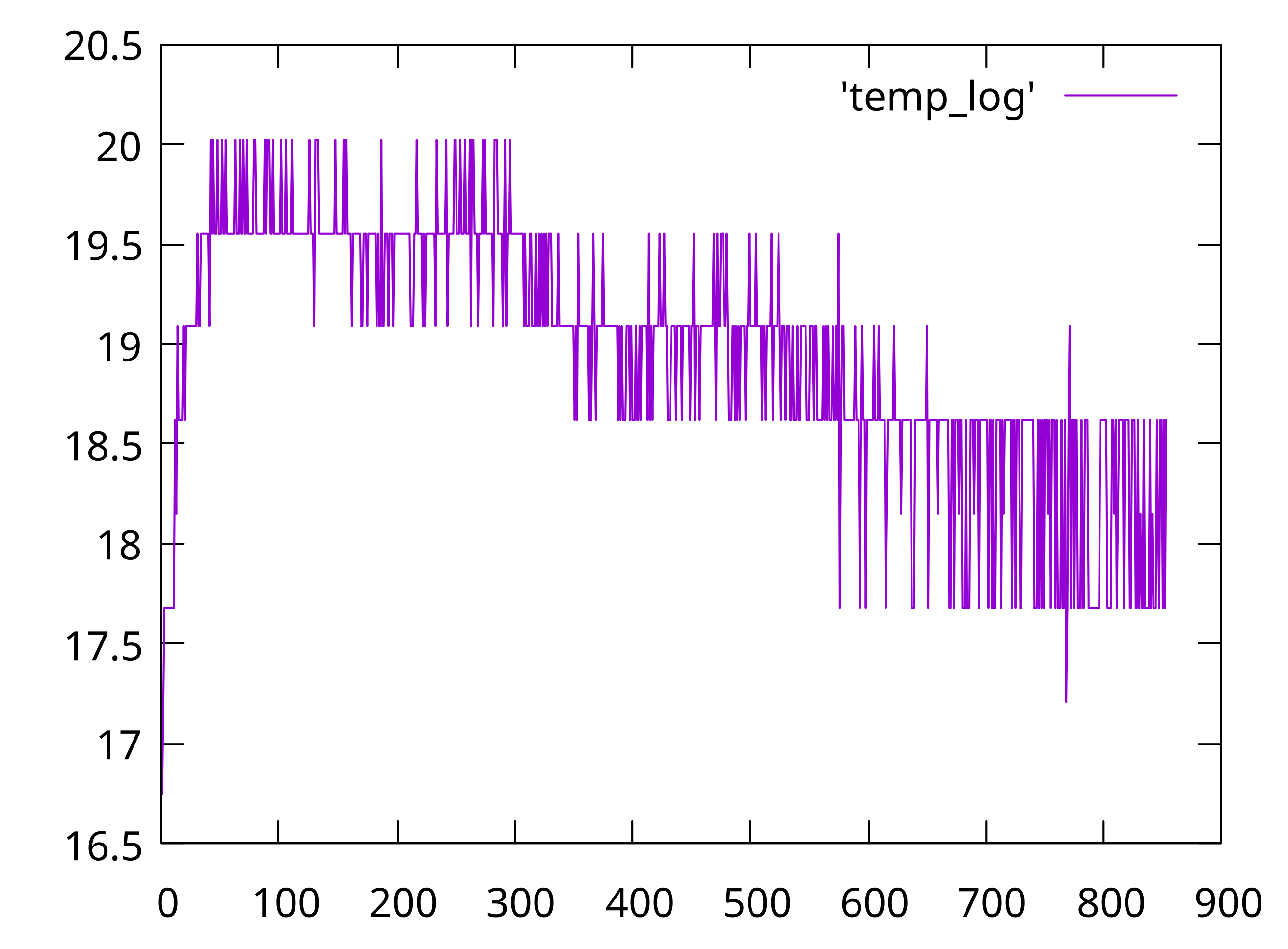
Plotting a timeseries graph with gnuplot
09 Nov 2022 | hacks TIL gnuplot raspberry pi picoSo, there was this raspberry pi contraption to log temperature to a file. The next step is to plot this in a graph. We get a single column file of recorded temperatures from the raspberry pi pico.
It is pretty easy to plot a graph from a two column file using gnuplot. If the filename is temp_log, all you need is:
plot 'temp_log' with lines
I was too lazy to find how to plot a single column file. The easy fix is to add another column with numbers. And that can be done easily with vim. You’d need to do the following keystrokes:
ctrl-v shift-g I 0 <space> <esc> - This will add a column of zeroes to the beginning

gv - This will reselect the column of zeroes

g ctrl-a - This will change the zeroes to an increasing sequence of numbers
Running gnuplot -persist plot.plt gets you the graph

Shower thought
- Boards like these don’t have a battery and can’t keep real clock time. I have never thought of that before. It would have been easy if we could log the time along with the temperature.
Next steps
- Blink an LED after writing to the file.
- Use
to_us_since_bootfrom the SDK while logging temperature.